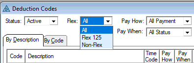
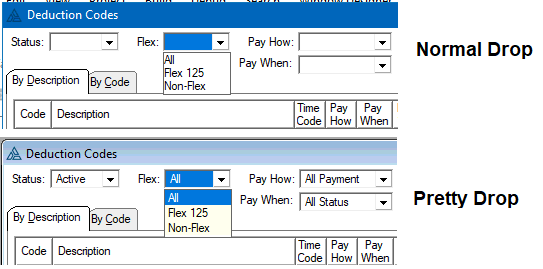
I’ve started to use Drop Lists more as taking less space than Radios. A Drop List can be hard to see. I made a little procedure to color them like a Tool Tip and add some left margin using a FORMAT.
The yellow tip background color is subtle. I wonder if anyone had any other ideas?
DropListPretty   PROCEDURE
Fld     LONG,AUTO
LstFEQ  LONG,AUTO
  CODE
  Fld=0
  LOOP
       Fld=0{PROP:NextField,Fld}
       IF Fld=0 THEN BREAK.
       CASE Fld{PROP:Type}
       OF   CREATE:List
       OROF CREATE:Combo

          LstFEQ = Fld{PROP:ListFEQ}
          IF LstFEQ AND Fld{PROP:Drop}>0 THEN
             LstFEQ{PROP:LineHeight}=1 + LstFEQ{PROP:LineHeight}    ! +1 more line space easier to read
             IF LstFEQ{PROP:Background}=COLOR:None THEN
                LstFEQ{PROP:Background}=COLOR:InfoBackground           !Yellow like tip
                LstFEQ{PROP:FontColor} =COLOR:InfoText                 !font color like tip should be black
             END
             IF ~LstFEQ{PROP:FORMAT} THEN
                 LstFEQ{PROP:FORMAT}='999L(2)@s255@'    !Margin of 2 else tight to line
             END
             !affects Entry not LIST --> LstFEQ{PROP:TextLeftMargin}=10
          END
       END
  END
  RETURN
A thicker border somehow? Bolder colors might help.I did make a System Color viewer.
Maybe color it like a caption, Blue for me.
        LstFEQ{PROP:Background}=COLOR:GradientInactiveCaption
        LstFEQ{PROP:FontColor} =COLOR:INACTIVECAPTIONTEXT